先从入门教程看起 了解一下
entire app is widget
class MyApp extends StatelessWidget {
  const MyApp({super.key});

  @override
  Widget build(BuildContext context) {
    return ChangeNotifierProvider(
      create: (context) => MyAppState(),
      child: MaterialApp(
        title: 'Namer App',
        theme: ThemeData(
          useMaterial3: true,
          colorScheme: ColorScheme.fromSeed(seedColor: Colors.deepOrange),
        ),
        home: MyHomePage(),
      ),
    );
  }
}- create app-wide state
- names the app
- define theme
- define home widget
class MyAppState extends ChangeNotifier {
  var current = WordPair.random();
}
ChangeNotifier → it can notify others about its own changes
The state is created and provided to the whole app using a ChangeNotifierProvider
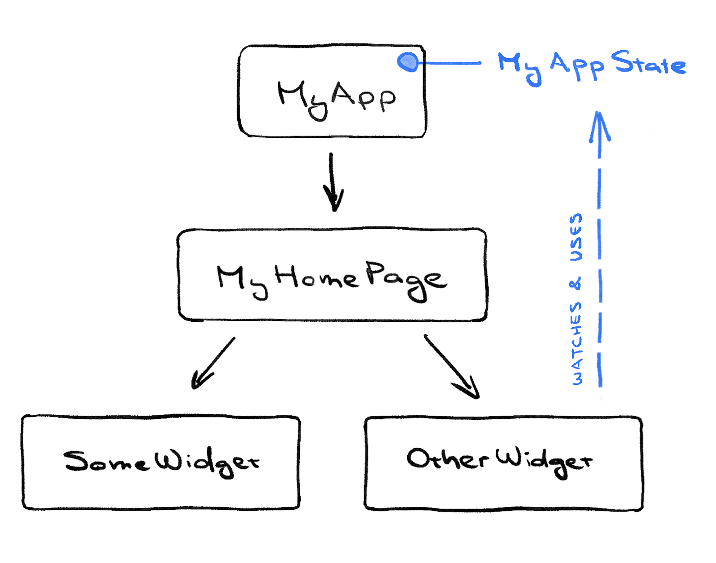
class MyHomePage extends StatelessWidget {
  @override
  Widget build(BuildContext context) {           // ← 1
	  # MyAppState -> (build) context  -> appstate 变量传递关系
    var appState = context.watch<MyAppState>();  // ← 2

    return Scaffold(                             // ← 3
      body: Column(                              // ← 4
        children: [
          Text('A random AWESOME idea:'),        // ← 5
          Text(appState.current.asLowerCase),    // ← 6
          ElevatedButton(
            onPressed: () {
              print('button pressed!');
            },
            child: Text('Next'),
          ),
        ],                                       // ← 7
      ),
    );
  }
}- Every widget defines a
build()method that’s automatically called every time the widget’s circumstances change so that the widget is always up to date. MyHomePagetracks changes to the app’s current state using thewatchmethod.- Every
buildmethod must return a widget or (more typically) a nested tree of widgets. In this case, the top-level widget isScaffold. You aren’t going to work withScaffoldin this codelab, but it’s a helpful widget and is found in the vast majority of real-world Flutter apps. BuildContext 这里相当于调度器 监控MyAppState 并将变量传递到 appState Columnis one of the most basic layout widgets in Flutter. It takes any number of children and puts them in a column from top to bottom. By default, the column visually places its children at the top. You’ll soon change this so that the column is centered.- You changed this
Textwidget in the first step. - This second
Textwidget takesappState, and accesses the only member of that class,current(which is aWordPair).WordPair(string1, string2) provides several helpful getters, such asasPascalCaseorasSnakeCase. Here, we useasLowerCasebut you can change this now if you prefer one of the alternatives. - Notice how Flutter code makes heavy use of trailing commas. This particular comma doesn’t need to be here, because
childrenis the last (and also only) member of this particularColumnparameter list. Yet it is generally a good idea to use trailing commas: they make adding more members trivial, and they also serve as a hint for Dart’s auto-formatter to put a newline there. For more information, see Code formatting.
Returns the word pair as a simple string, with second word capitalized, like "keyFrame" or "franceLand". This is informally called “camel case”.latefinal
Returns the word pair as a simple string, in lower case, like "keyframe" or "franceland".latefinal
Returns the word pair as a simple string, with each word capitalized, like "KeyFrame" or "BigUsa". This is informally called “pascal case”.latefinal
Returns the word pair as a simple string, separated by an underscore, like "key_frame" or "big_usa". This is informally called “snake case”.latefinal
Returns the word pair as a simple string, like "keyframe" or "bigFrance".latefinal
Returns the word pair as a simple string, in upper case, like "KEYFRAME" or "FRANCELAND".
class MyAppState extends ChangeNotifier {
  var current = WordPair.random();

  // ↓ Add this.
  void getNext() {
    current = WordPair.random();
    notifyListeners();
  }
}
The new `getNext()` method reassigns `current` with a new random `WordPair`. It also calls `notifyListeners()`(a method of `ChangeNotifier)`that ensures that anyone watching `MyAppState` is notified.ElevatedButton(
onPressed: () {
appState.getNext(); // ← This instead of print().
},
child: Text('Next'),
),进步一下
把 Text(appState.current.asLowerCase) 分成两步写
var pair= appState.current
Text(pair.asLowerCase)
现在我们试一下refactor widget 选中该 Text ctrl + . → Extract Widget
现在我们有这个class
class BIGCARD extends StatelessWidget {
  const BIGCARD({
    super.key,
    required this.pair,
  });

  final WordPair pair;

  @override
  Widget build(BuildContext context) {
    return Text(pair.asLowerCase);
  }
在这里的Text 选中 → Wrap With Padding
轻松把 Widget type 和 padding wrap 到一起
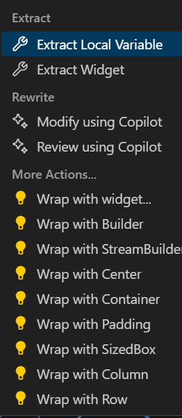
这里Padding再wrap with widget
class BIGCARD extends StatelessWidget {
  const BIGCARD({
    super.key,
    required this.pair,
  });
	#注意这里final的意思是说 一旦外面带入 pair 那么widget里面就是fixed
	#所以这里面也没有 appstate
  final WordPair pair;

  @override
  Widget build(BuildContext context) {
    return Padding(
      padding: const EdgeInsets.all(20),
      child: Text(pair.asLowerCase),
    );
  }
—> 可以 把刚生成的padding 与新元素 并列 这里没有并列 只是用Card class 把包含其中的padding refactor了 再padding 上添加新的规范 自下而上parent clas
@override
  Widget build(BuildContext context) {
    return Card(
      child: Padding(
        padding: const EdgeInsets.all(20),
        child: Text(pair.asLowerCase),
      ),
    );
  }
再加上两行的 color theme
@override
  Widget build(BuildContext context) {
    #注意这个context 会跟着在每一个build里 为全局变量 带入到每一个widget中
    final theme = Theme.of(context);

    return Card(
	    #除了primary 还有.secondary .surface等等
      color: theme.colorScheme.primary,
      child: Padding(
        padding: const EdgeInsets.all(20),
        child: Text(pair.asLowerCase),
      ),
    );
  }
这里的theme 是最早在Myapp 全局范围时 定义的
很有意思的是这里是theme/color scheme 来自于一个seed color
theme: ThemeData(
          useMaterial3: true,
          colorScheme: ColorScheme.fromSeed(seedColor: Colors.deepOrange),
        ),
然后调整文字格式
#build中
final style = theme.textTheme.displayMedium!.copyWith(
      color: theme.colorScheme.onPrimary,
    );

#return中
child: Text(pair.asLowerCase, style: style),

#加上 accessibility feature
child: Text(pair.asLowerCase, style: style, semanticsLabel: "${pair.first} ${pair.second}",),-
By using
theme.textTheme,you access the app’s font theme. This class includes members such asbodyMedium(for standard text of medium size),caption(for captions of images), orheadlineLarge(for large headlines). -
The
displayMediumproperty is a large style meant for display text. The word display is used in the typographic sense here, such as in display typeface. The documentation fordisplayMediumsays that “display styles are reserved for short, important text”—exactly our use case. -
The theme’s
displayMediumproperty could theoretically benull. Dart, the programming language in which you’re writing this app, is null-safe, so it won’t let you call methods of objects that are potentiallynull. In this case, though, you can use the!operator (“bang operator”) to assure Dart you know what you’re doing. (displayMediumis definitely not null in this case. The reason we know this is beyond the scope of this codelab, though.) -
Calling
copyWith()ondisplayMediumreturns a copy of the text style with the changes you define. In this case, you’re only changing the text’s color.注意这里copyWith() 中可以添加更多其它更有意义的参数来改变
-
To get the new color, you once again access the app’s theme. The color scheme’s
onPrimaryproperty defines a color that is a good fit for use on the app’s primary color. 注意这里的意思是跟primary color很搭的color 才是onPrimary
现在我们可以把build和return暂时分开 其中build可以看作 整体初始化 UI的一些值
使得return 可以直接使用值
现在我们改一下column 的设定
return Scaffold(
      body: Column(
				#在column 之中中间对齐 也就是y轴中间 但是两边左右padding还没变
        mainAxisAlignment: MainAxisAlignment.center,  // ← Add this.
        children: [
          Text('A random AWESOME idea:'),
          BigCard(pair: pair),

					#只占用height 空间 不render
					SizedBox(height: 10),
          ElevatedButton(
            onPressed: () {
              appState.getNext();
            },
            child: Text('Next'),
          ),
        ],
      ),
    );
这里要让左右两边也对齐 我们用Center wrap 在column外面
加一点逻辑
class MyAppState extends ChangeNotifier {
  var current = WordPair.random();

  void getNext() {
    current = WordPair.random();
    notifyListeners();
  }

  // ↓ Add the code below.
  var favorites = <WordPair>[];

  void toggleFavorite() {
    if (favorites.contains(current)) {
      favorites.remove(current);
    } else {
      favorites.add(current);
    }
    notifyListeners();  #每一个function 都要call一遍吗 有没有省略的方式?
  }
}- You added a new property to
MyAppStatecalledfavorites. This property is initialized with an empty list:[]. - You also specified that the list can only ever contain word pairs:
<WordPair>[], using generics. This helps make your app more robust—Dart refuses to even run your app if you try to add anything other thanWordPairto it. In turn, you can use thefavoriteslist knowing that there can never be any unwanted objects (likenull) hiding in there.
Note: Dart has collection types other than List (expressed with []). You could argue that a Set (expressed with {}) would make more sense for a collection of favorites. To make this codelab as straightforward as possible, we’re sticking with a list. But if you want, you can use a Set instead. The code wouldn’t change much.
- You also added a new method,
toggleFavorite(), which either removes the current word pair from the list of favorites (if it’s already there), or adds it (if it isn’t there yet). In either case, the code callsnotifyListeners();afterwards.
接下来就是更新UI 我们在next左边加东西的逻辑就是把Next wrap 到一个row 中 然后在row左侧加
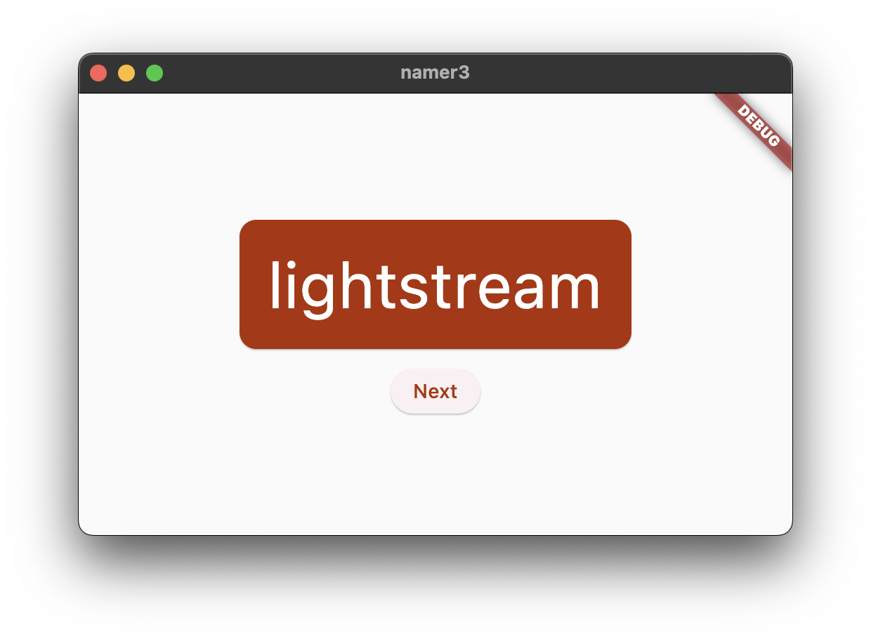
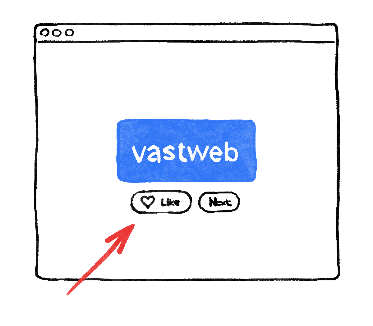
return Scaffold(
      body: Center(
        child: Column(
          mainAxisAlignment: MainAxisAlignment.center,
          children: [
            BigCard(pair: pair),
            SizedBox(height: 10),
            Row(
							#这一行具体是什么意思 但是将 buttion的x轴 中间对齐了
              mainAxisSize: MainAxisSize.min,   // ← Add this.
              children: [
                ElevatedButton(
                  onPressed: () {
                    appState.getNext();
                  },
                  child: Text('Next'),
                ),
              ],
            ),
          ],
        ),
      ),
    );
ElevatedButton → → ElevatedButton.icon(onPressed: (){}, icon: abc, label: Text(’xxx’))
ElevatedButton.icon(
                  onPressed: () {
                    appState.toggleFavorite();
                  },
                  icon: Icon(icon),
                  label: Text('Like'),
                ),
// ↓ Add this.
IconData icon;
if (appState.favorites.contains(pair)) {
icon = Icons.favorite;
} else {
icon = Icons.favorite_border;
}
return Scaffold(
body: Center(
child: Column(
mainAxisAlignment: MainAxisAlignment.center,
children: [
BigCard(pair: pair),
SizedBox(height: 10),
Row(
mainAxisSize: MainAxisSize.min,
children: [
// ↓ And this.
ElevatedButton.icon(
onPressed: () {
appState.toggleFavorite();
},
icon: Icon(icon),
label: Text('Like'),
),
SizedBox(width: 10),
ElevatedButton(
onPressed: () {
appState.getNext();
},
child: Text('Next'),
),
],
),
],
),
),
);OK那如果我们想分页 现在需要 StatefulWidget
class MyHomePage extends StatelessWidget {
  @override
  Widget build(BuildContext context) {
    return Scaffold(
			#将界面分成左右两row 按row来的话 后面加widget都各自成row
      body: Row(
        children: [
					#safeArea 代表什么 注意这里没有说就默认上下排布
          SafeArea(
						#注意这里是 NavigationRail 里带的两个 NavigationRailDestination
            child: NavigationRail(
              extended: false,
              destinations: [
                NavigationRailDestination(
                  icon: Icon(Icons.home),
                  label: Text('Home'),
                ),
                NavigationRailDestination(
                  icon: Icon(Icons.favorite),
                  label: Text('Favorites'),
                ),
              ],
              selectedIndex: 0,
              onDestinationSelected: (value) {
                print('selected: $value');
              },
            ),
          ),
          Expanded(
            child: Container(
              color: Theme.of(context).colorScheme.primaryContainer,
              child: GeneratorPage(),
            ),
          ),
        ],
      ),
    );
  }
}

class GeneratorPage extends StatelessWidget {
  @override
  Widget build(BuildContext context) {
    var appState = context.watch<MyAppState>();
    var pair = appState.current;

    IconData icon;
    if (appState.favorites.contains(pair)) {
      icon = Icons.favorite;
    } else {
      icon = Icons.favorite_border;
    }

    return Center(
      child: Column(
        mainAxisAlignment: MainAxisAlignment.center,
        children: [
          BigCard(pair: pair),
          SizedBox(height: 10),
          Row(
            mainAxisSize: MainAxisSize.min,
            children: [
              ElevatedButton.icon(
                onPressed: () {
                  appState.toggleFavorite();
                },
                icon: Icon(icon),
                label: Text('Like'),
              ),
              SizedBox(width: 10),
              ElevatedButton(
                onPressed: () {
                  appState.getNext();
                },
                child: Text('Next'),
              ),
            ],
          ),
        ],
      ),
    );
  }
}- First, notice that the entire contents of
MyHomePageis extracted into a new widget,GeneratorPage. The only part of the oldMyHomePagewidget that didn’t get extracted isScaffold. - The new
MyHomePagecontains aRowwith two children. The first widget isSafeArea, and the second is anExpandedwidget. - The
SafeAreaensures that its child is not obscured by a hardware notch or a status bar. In this app, the widget wraps aroundNavigationRailto prevent the navigation buttons from being obscured by a mobile status bar, for example. - You can change the
extended: falseline in NavigationRail totrue. This shows the labels next to the icons. In a future step, you will learn how to do this automatically when the app has enough horizontal space. - The navigation rail has two destinations (Home and Favorites), with their respective icons and labels. It also defines the current
selectedIndex. A selected index of zero selects the first destination, a selected index of one selects the second destination, and so on. For now, it’s hard coded to zero. 这里定义selectedIndex是NavigationRail既定的paramateronDestinationSelected也是同理 代表选中会怎么样 为用户输入 - The navigation rail also defines what happens when the user selects one of the destinations with
onDestinationSelected. Right now, the app merely outputs the requested index value withprint(). - The second child of the
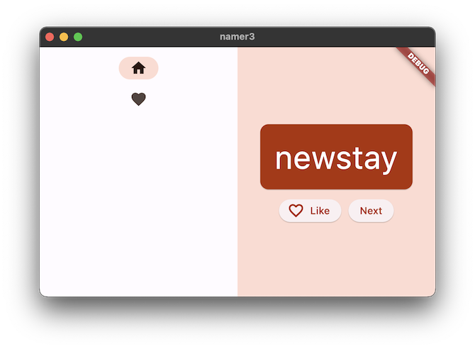
Rowis theExpandedwidget. Expanded widgets are extremely useful in rows and columns—they let you express layouts where some children take only as much space as they need (SafeArea, in this case) and other widgets should take as much of the remaining room as possible (Expanded, in this case). One way to think aboutExpandedwidgets is that they are “greedy”. If you want to get a better feel of the role of this widget, try wrapping theSafeAreawidget with anotherExpanded. The resulting layout looks something like this:
- Two
Expandedwidgets split all the available horizontal space between themselves, even though the navigation rail only really needed a little slice on the left. - Inside the
Expandedwidget, there’s a coloredContainer, and inside the container, theGeneratorPage.
把state赋予widget
Some state is only relevant to a single widget, so it should stay with that widget.
Enter the StatefulWidget, a type of widget that has State. First, convert MyHomePage to a stateful widget (注意现在是stateless 就是说所有state 听从 MyAppState 再强调一下是通过全局context来watch的)
class MyHomePage extends StatefulWidget {
  @override
  State<MyHomePage> createState() => _MyHomePageState();
}

class _MyHomePageState extends State<MyHomePage> {
		Widget build(BuildContext context){
			...
The IDE creates a new class for you, _MyHomePageState. This class extends State, and can therefore manage its own values. (It can change itself.) Also notice that the build method from the old, stateless widget has moved to the _MyHomePageState (instead of staying in the widget). It was moved verbatim—nothing inside the build method changed. It now merely lives somewhere else.
新建state(of 自己的 class MyHomePage) 为 _MyHomePageState class
create state 是系统func 为StatefulWidget 制造state
*The underscore (_) at the start of _MyHomePageState makes that class private and is enforced by the compiler.
现在我们在 state class 中定义我们的变量
在State class中定义变量:
var selectedIndex = 0;
然后在build → return 中:
selectedIndex: selectedIndex,    // ← Change to this.
onDestinationSelected: (value) {

                // ↓ Replace print with this.
                setState(() {
                  selectedIndex = value;
                });

              },
所以系统自动implement的逻辑是:
选中→ 产生的对应value → set value as selectedIndex(或者用value去干什么别的事)
而不是:
选中 → 直接get NavigationRailDestination 元素 → 对元素进行操作
分页操作
Widget page;
switch (selectedIndex) {
  case 0:
    page = GeneratorPage();
    break;
  case 1:
    page = Placeholder();
    break;
  default:
    throw UnimplementedError('no widget for $selectedIndex');
}- The code declares a new variable,
page, of the typeWidget. - Then, a switch statement assigns a screen to
page, according to the current value inselectedIndex. - Since there’s no
FavoritesPageyet, usePlaceholder; a handy widget that draws a crossed rectangle wherever you place it, marking that part of the UI as unfinished.

- Applying the fail-fast principle, the switch statement also makes sure to throw an error if
selectedIndexis neither 0 or 1. This helps prevent bugs down the line. If you ever add a new destination to the navigation rail and forget to update this code, the program crashes in development (as opposed to letting you guess why things don’t work, or letting you publish a buggy code into production).
build 和 return 可以区分一下
build 相当于是赋予return state(type of widget, type of render) 然后return可以定义一些在state后的东西(implement 细节, icon, 名字, text) 但是主要为固定内容
相当于js 和 html
Flutter provides several widgets that help you make your apps automatically responsive. For example, Wrap is a widget similar to Row or Column that automatically wraps children to the next “line” (called “run”) when there isn’t enough vertical or horizontal space. There’s FittedBox, a widget that automatically fits its child into available space according to your specifications.
But NavigationRail doesn’t automatically show labels when there’s enough space because it can’t know what is enough space in every context. It’s up to you, the developer, to make that call.
Say you decide to show labels only if MyHomePage is at least 600 pixels wide.
Note: Flutter works with logical pixels as a unit of length. They are also sometimes called device-independent pixels. A padding of 8 pixels is visually the same regardless of whether the app is running on an old low-res phone or a newer ‘retina’ device. There are roughly 38 logical pixels per centimeter, or about 96 logical pixels per inch, of the physical display.
The widget to use, in this case, is LayoutBuilder. It lets you change your widget tree depending on how much available space you have.
Once again, use Flutter’s Refactor menu in VS Code to make the required changes. This time, though, it’s a little more complicated:
- Inside
_MyHomePageState’sbuildmethod, put your cursor onScaffold. - Call up the Refactor menu with
Ctrl+.(Windows/Linux) orCmd+.(Mac). - Select Wrap with Builder and press Enter.
- Modify the name of the newly added
BuildertoLayoutBuilder. - Modify the callback parameter list from
(context)to(context, constraints).
LayoutBuilder’s builder callback is called every time the constraints change. This happens when, for example:
- The user resizes the app’s window
- The user rotates their phone from portrait mode to landscape mode, or back
- Some widget next to
MyHomePagegrows in size, makingMyHomePage’s constraints smaller - And so on
基本上就是把 constraint 也就是 physical/logical pixel size 代入到 build/return 中
可以自适应调整一些 ele 的显示情况 (如果width很长 ← 横屏 就会显示extended version)
extended: constraints.maxWidth >= 600,
下面是自己尝试做一下第二页:
If you feel adventurous, try to do this step by yourself. Your goal is to show the list of favorites in a new stateless widget, FavoritesPage, and then show that widget instead of the Placeholder.
Here are a few pointers:
- When you want a
Columnthat scrolls, use theListViewwidget. - Remember, access the
MyAppStateinstance from any widget usingcontext.watch<MyAppState>(). - If you also want to try a new widget,
ListTilehas properties liketitle(generally for text),leading(for icons or avatars) andonTap(for interactions). However, you can achieve similar effects with the widgets you already know. - Dart allows using
forloops inside collection literals. For example, ifmessagescontains a list of strings, you can have code like the following:
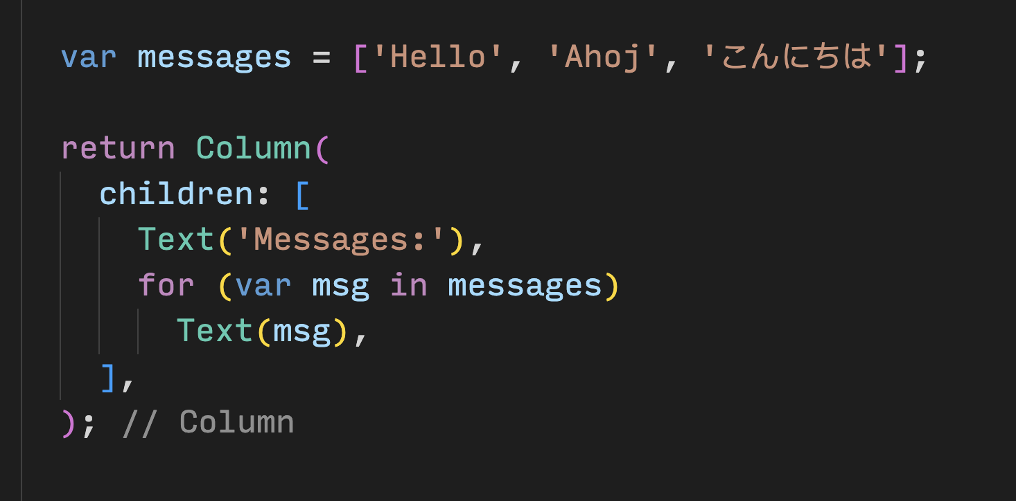
On the other hand, if you’re more familiar with functional programming, Dart also lets you write code like messages.map((m) => Text(m)).toList(). And, of course, you can always create a list of widgets and imperatively add to it inside the build method.
The advantage of adding the Favorites page yourself is that you learn more by making your own decisions. The disadvantage is that you might run into trouble that you aren’t yet able to solve by yourself. Remember: failing is okay, and is one of the most important elements of learning. Nobody expects you to nail Flutter development in your first hour, and neither should you.
我的实现是这样的:
class FavoritesPage extends StatelessWidget {
  @override
  Widget build(BuildContext context) {
    var appState = context.watch<MyAppState>();
    var favorites = appState.favorites;

    return ListView(
	    #每pair 建立一个 ListTile constructor func with return
      children: favorites.map((pair) {
        return ListTile(
          title: Text(pair.asLowerCase),
          trailing: IconButton(
            icon: Icon(Icons.delete),
            onPressed: () {
              appState.toggleFavorite(pair);
            },
          ),
        );
      }).toList(),

    );

  }
}